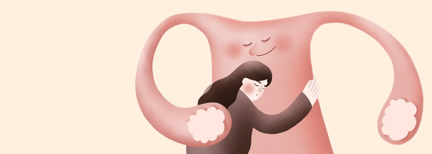
Poly Health
UI/UX Design, 2022
Undergraduate Final Year Project
Duration: 5 months
Tools: Figma, Procreate, Adobe Illustrator
How can graphic design improve human well-being by making healthcare delivery more efficient, understanding, and empathetic?
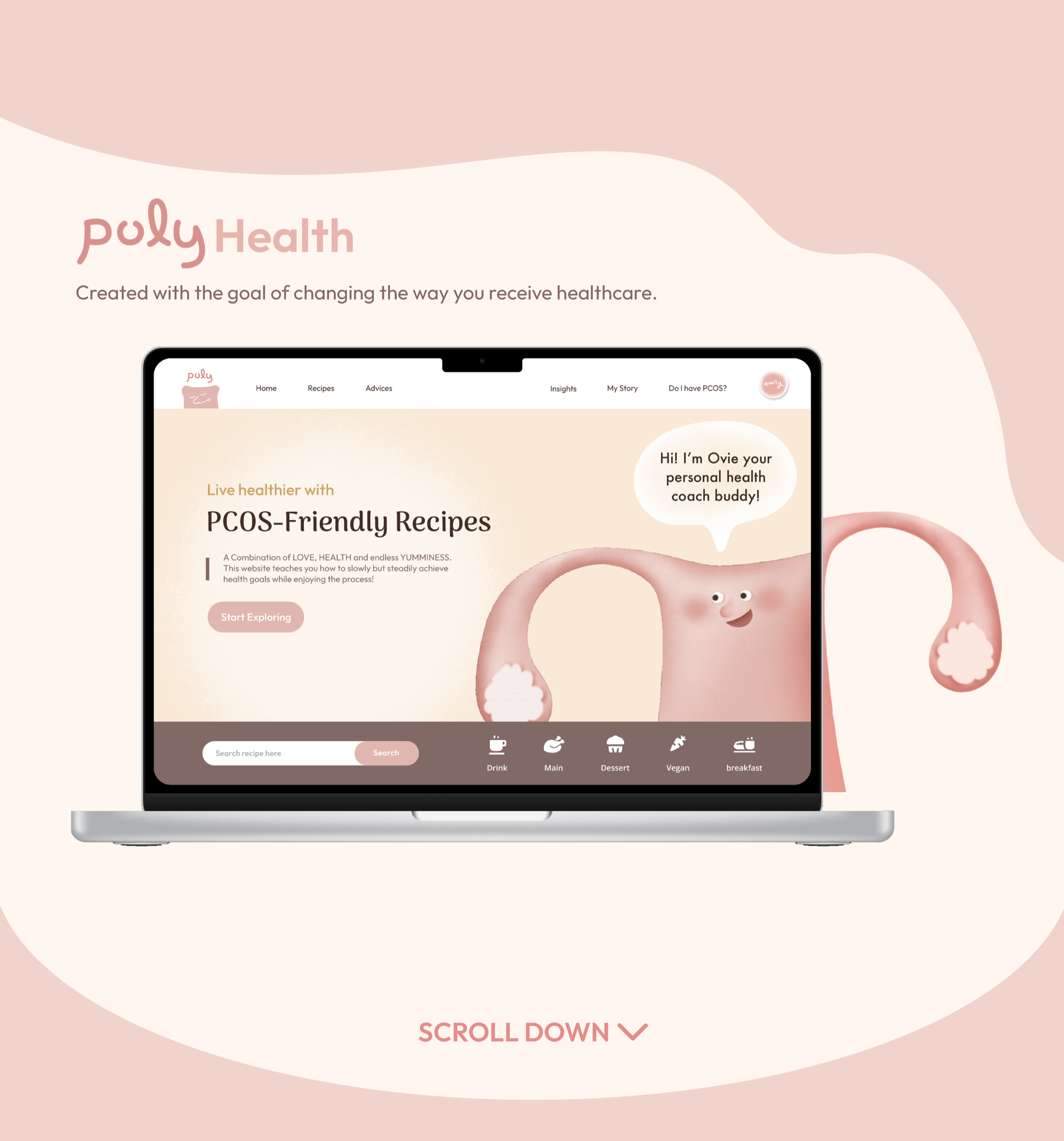
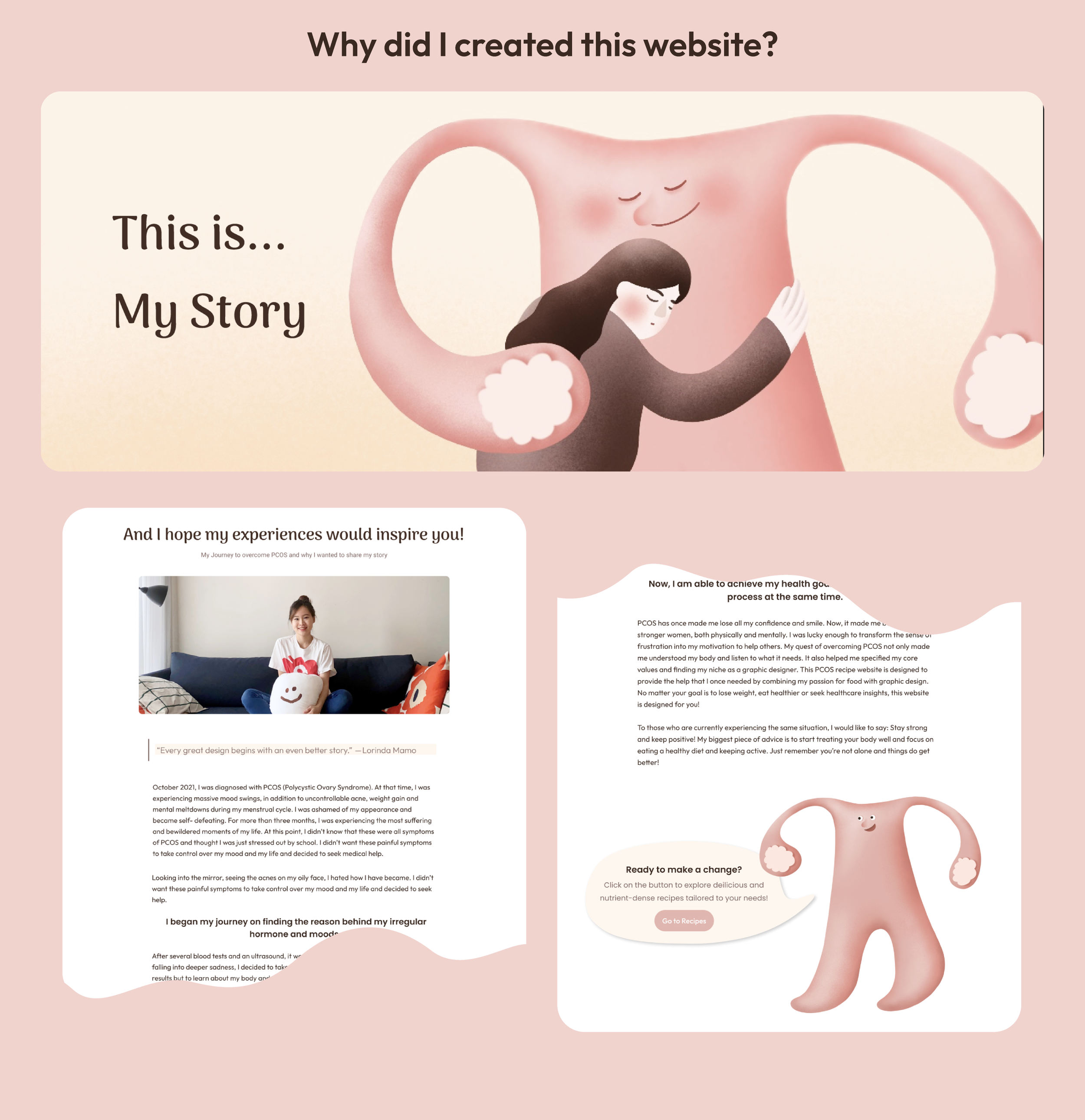
POLY Health is a UI/UX project inspired by my own diagnosis of PCOS (Polycystic Ovary Syndrome) in 2021. Facing difficulties in accessing proper medical support — including a near misdiagnosis — made me realize how urgently healthcare systems need more empathetic design.
This platform offers dietary advice, recipes, symptom tracking, and healthcare insights to support patients throughout their health journey. It focuses on reversing PCOS through lifestyle and diet changes, and emphasizes accessibility, positivity, and practical tools for sustainable well-being.
Identify Problems:
Carried out market research (age range 16-60) to assess satisfaction with the current healthcare system and pinpoint opportunities for improvement
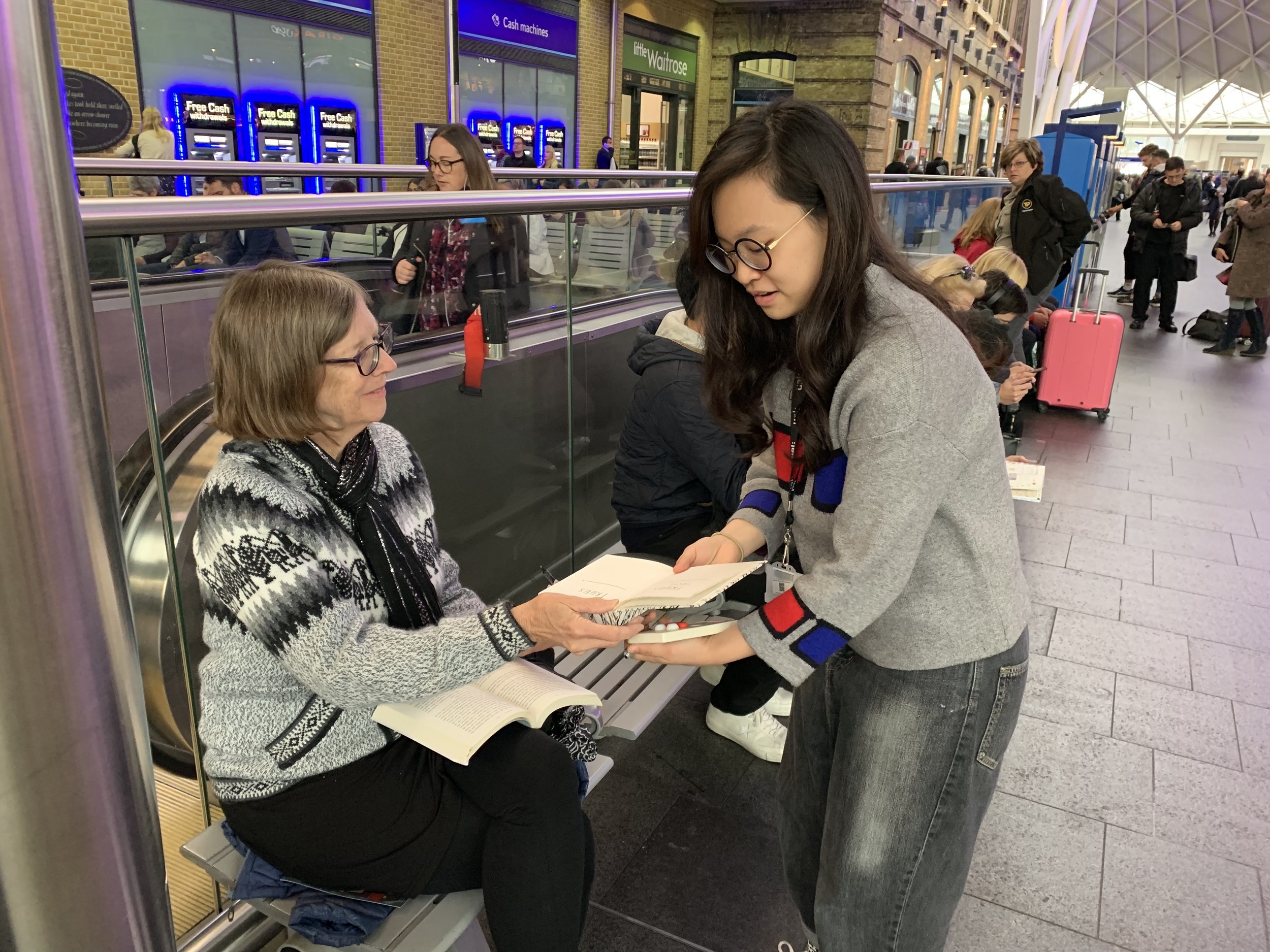
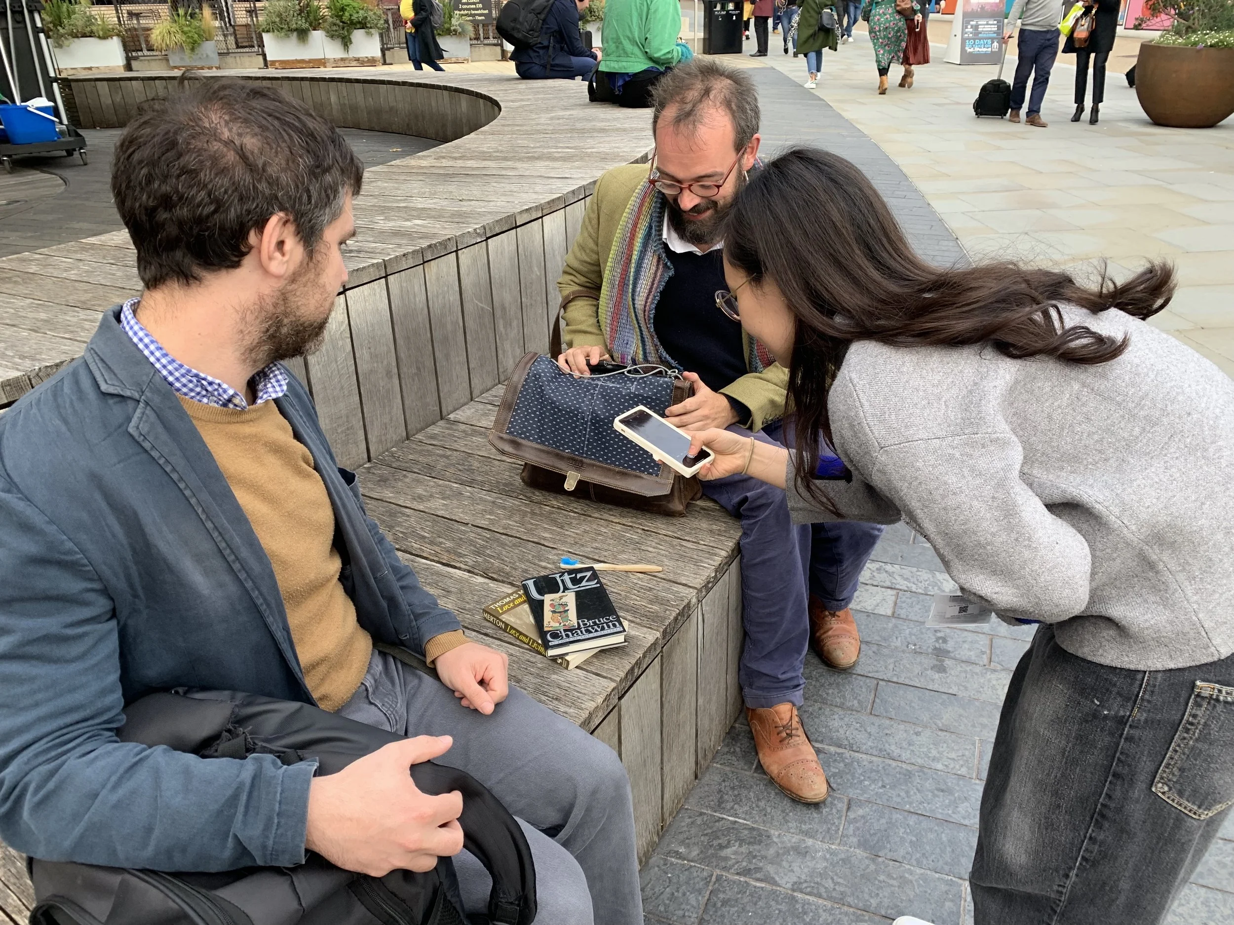
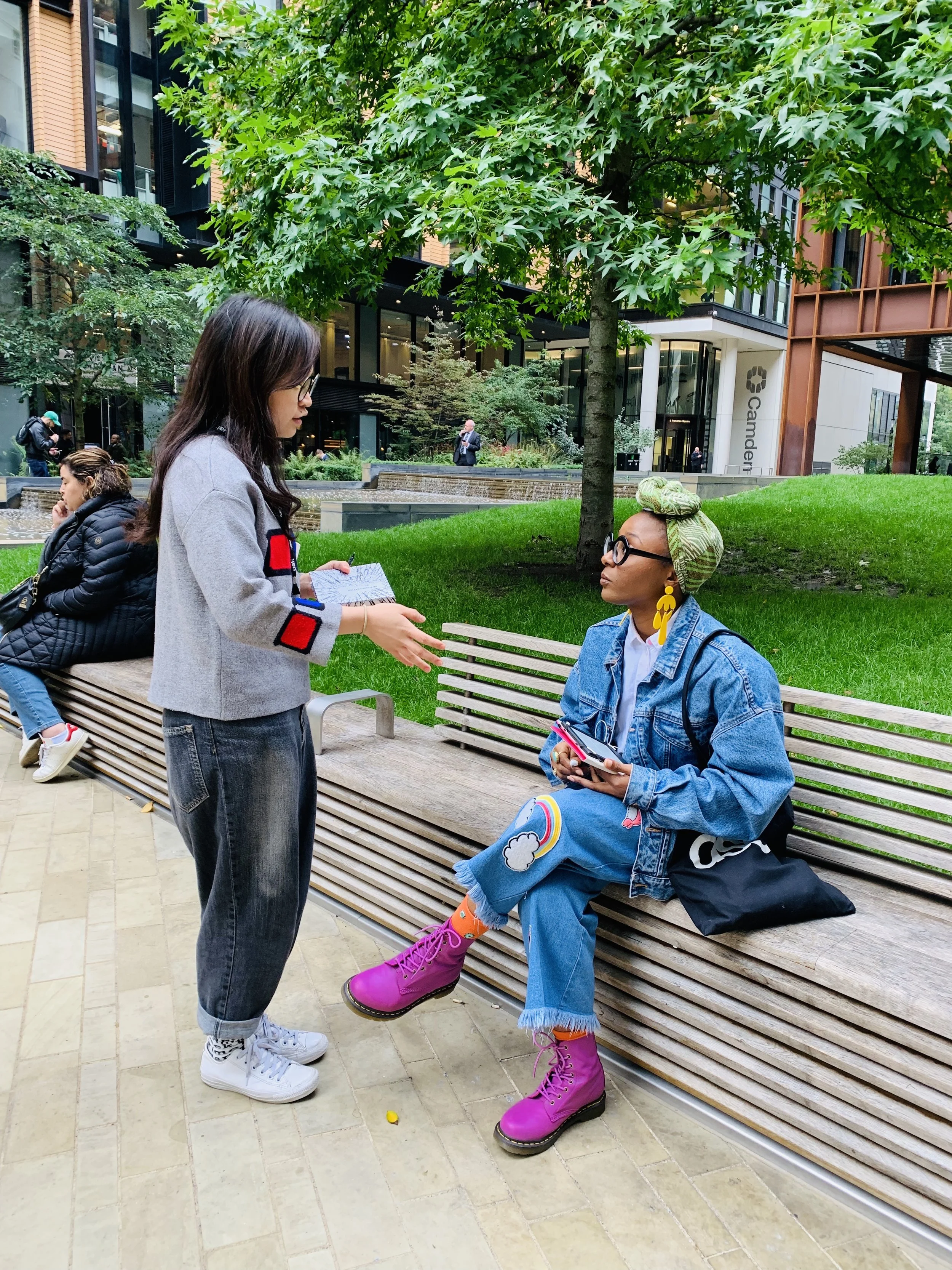

Long waiting times- GP appointments can take weeks to secure, reducing access to timely care
System remains too hospital-centric rather than focused on community and preventive care
Chronic shortage of doctors, nurses, and allied health professionals
Fragmented IT systems between GP, hospital, and social care
Survey insights from young women recently diagnosed with PCOS revealed the main reasons why the condition is often misdiagnosed or overlooked:
Solution:
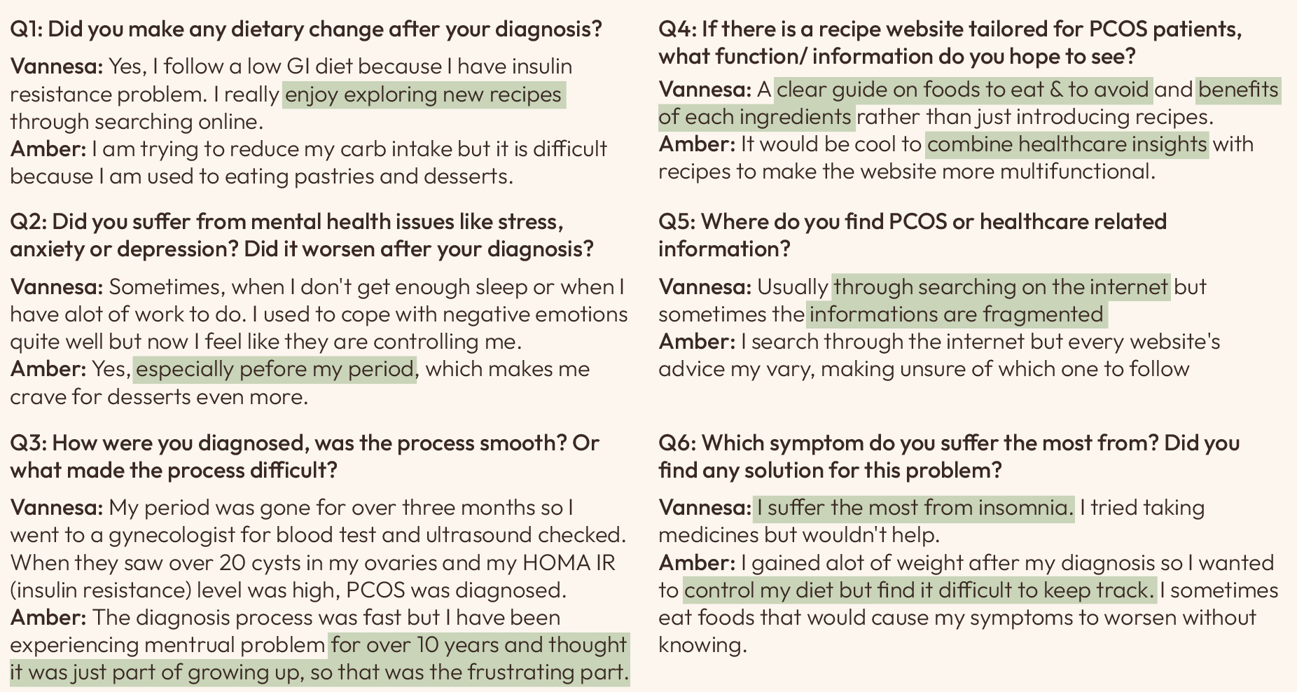
Trying to fix the healthcare system from within is often slow, politically complex, and expensive. Instead, starting from the outside — by focusing on prevention, healthy living, and community-based interventions — is a more practical and sustainable way to ease the system’s burden over time.
There is a need for a more empathetic and user-centered platform for individuals with PCOS — a platform that communicates information in an approachable manner and provides comprehensive support throughout the diagnostic journey, including where to seek medical help, how to implement dietary adjustments, and strategies for sustaining a healthy lifestyle.
Symptoms are often mistaken for a simple case of menstrual irregularity in young women
Tried searching online for help, but most of the information was either scattered or too medically technical to understand
There’s no single website that integrates informations like academic knowledge, ways to seek help, symptom relief strategies, and self-check questionnaire.
Some made dietary changes and saw improvement; however, most websites don’t tailor their advice to individual conditions, as PCOS symptoms vary from person to person
Formating
After identifying the key areas to focus on based on needs of the targeted audience, I moved on to devising the app structure and what the user journey would look like. This makes it easier to to visualize how the user would navigate through the website and finding the smoothest connection between each parts.

user persona
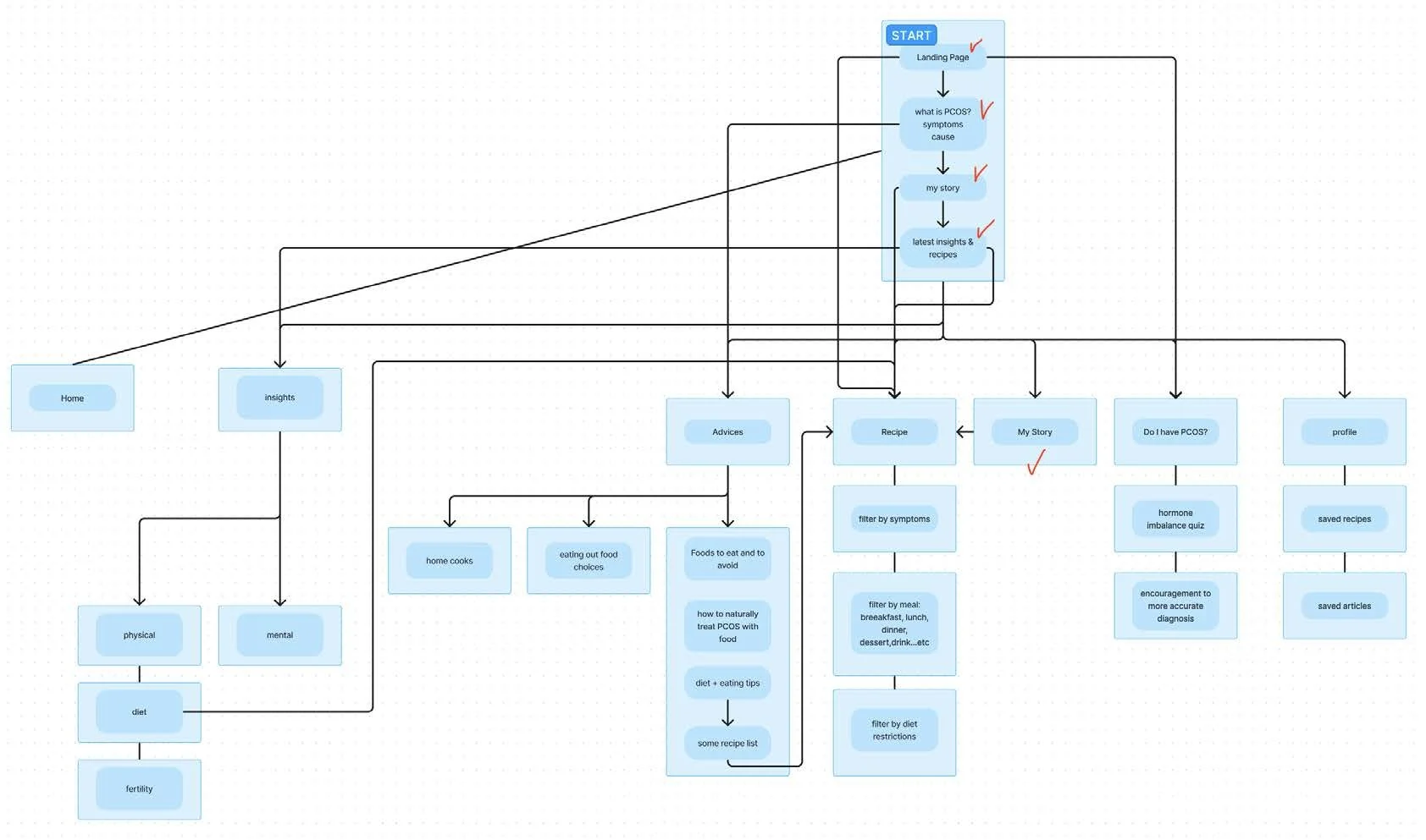
user flowchart
Once the foundational structure was in place, I developed wireframes to test potential screen layouts. This process allowed me to iterate on user flows before investing time in detailed visual design.
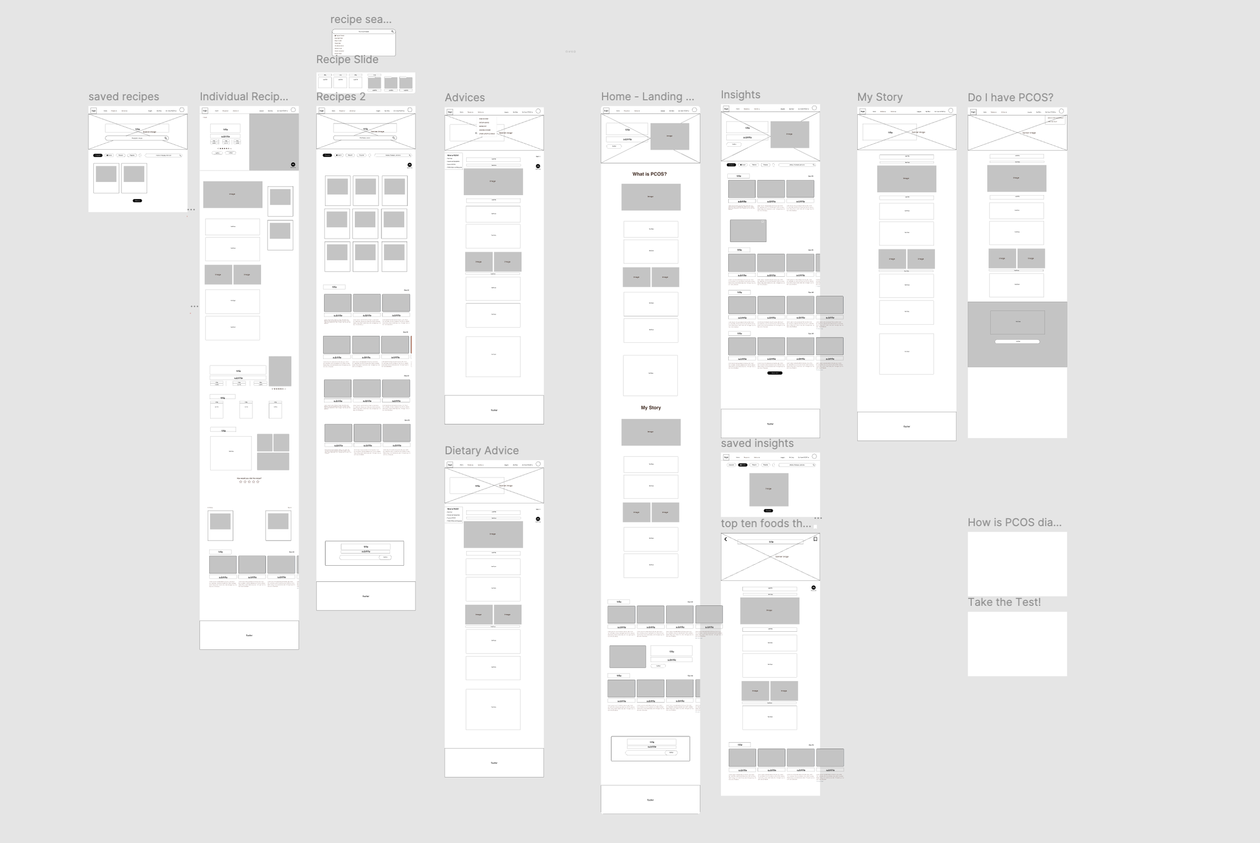
website wireframes
The main focus during these initial stages was to combine:
My own story- to inspire other women facing same difficulties
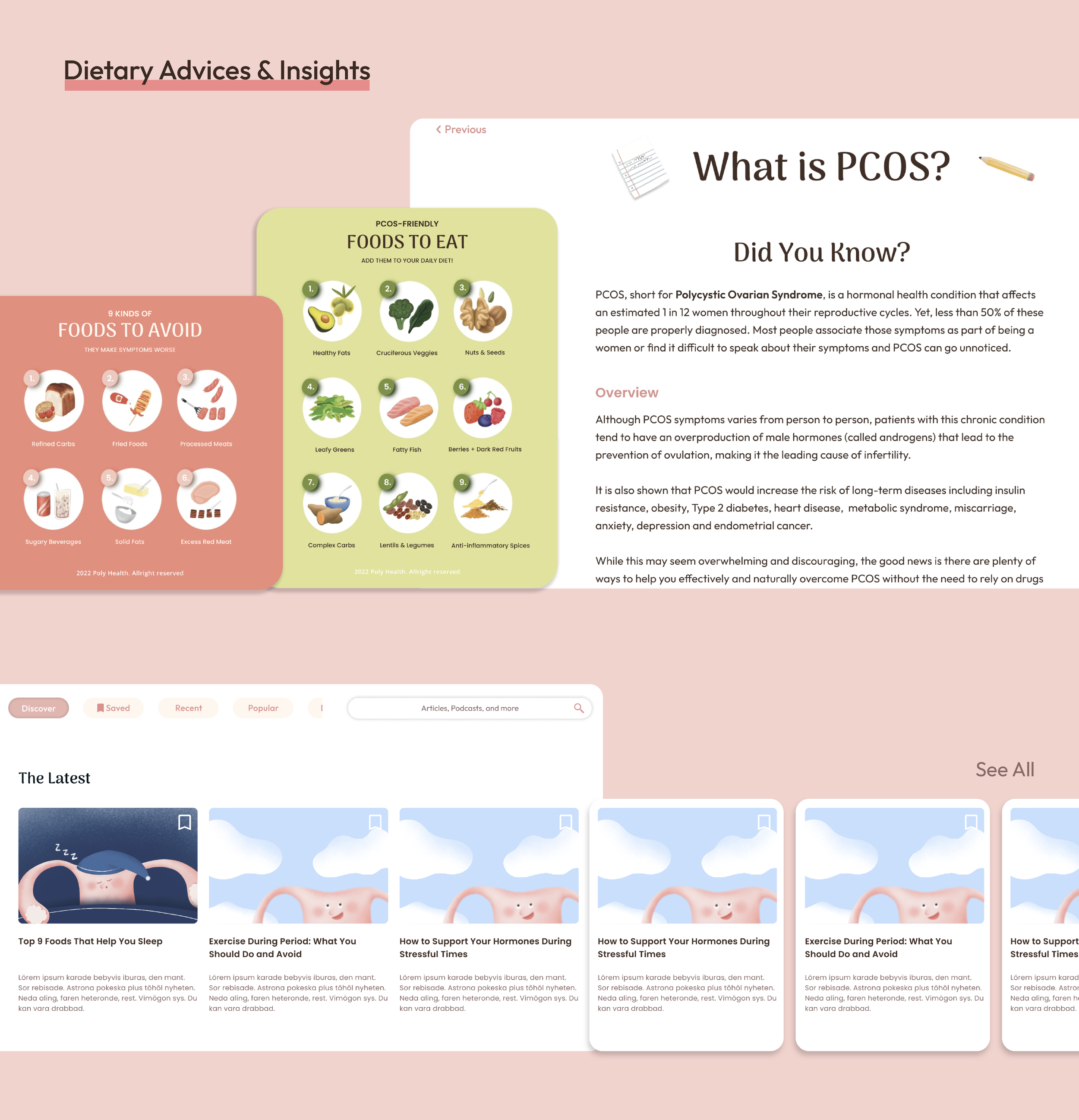
healthcare knowledge- What is PCOS?
PCOS friendly recipes categorized by symptoms- promote slower but long term lifestyle change rather than medication
Lifestyle insights- daily posts featuring tips on mental health, smart eating-out choices, exercise routines, and other healthy lifestyle habits
Quick self-testing questionnaire- Do I have PCOS? Where to seek professional help?
UI Design
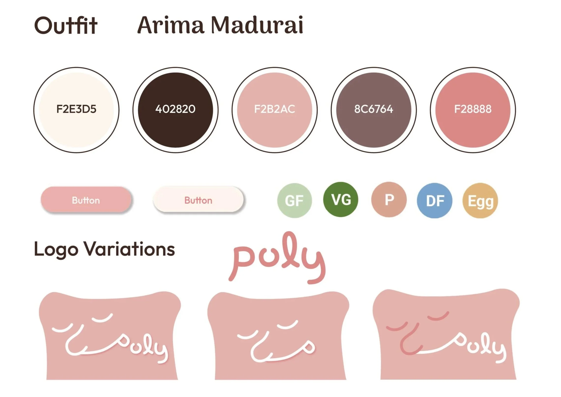
With the wireframes finalized, I moved on to UI design and created development-ready mockups. This stage involved defining the app’s visual identity ( typography, color palette, and component library) to ensure it aligned with the website’s empathetic, therapeutic, and playful design guidelines.
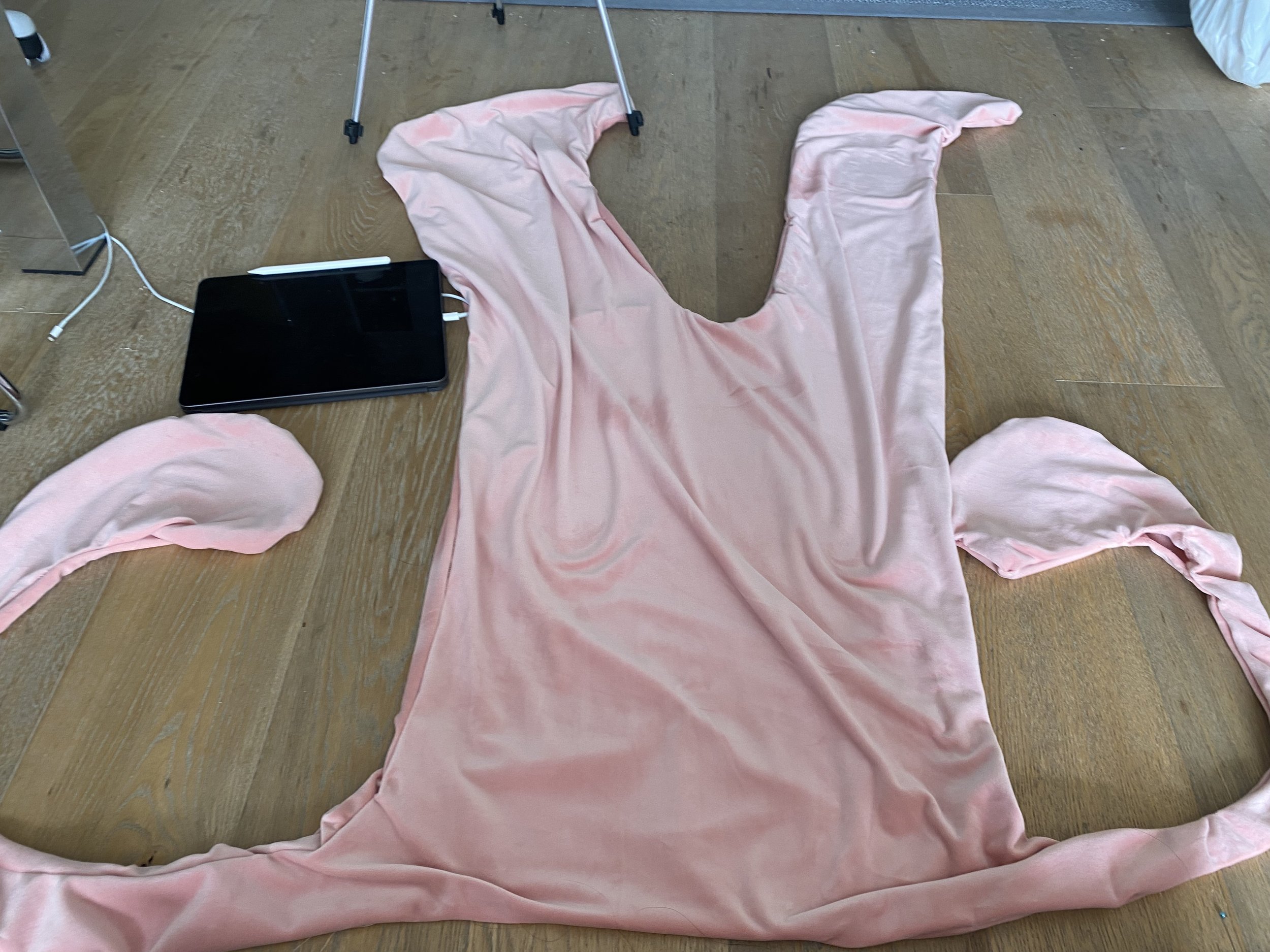
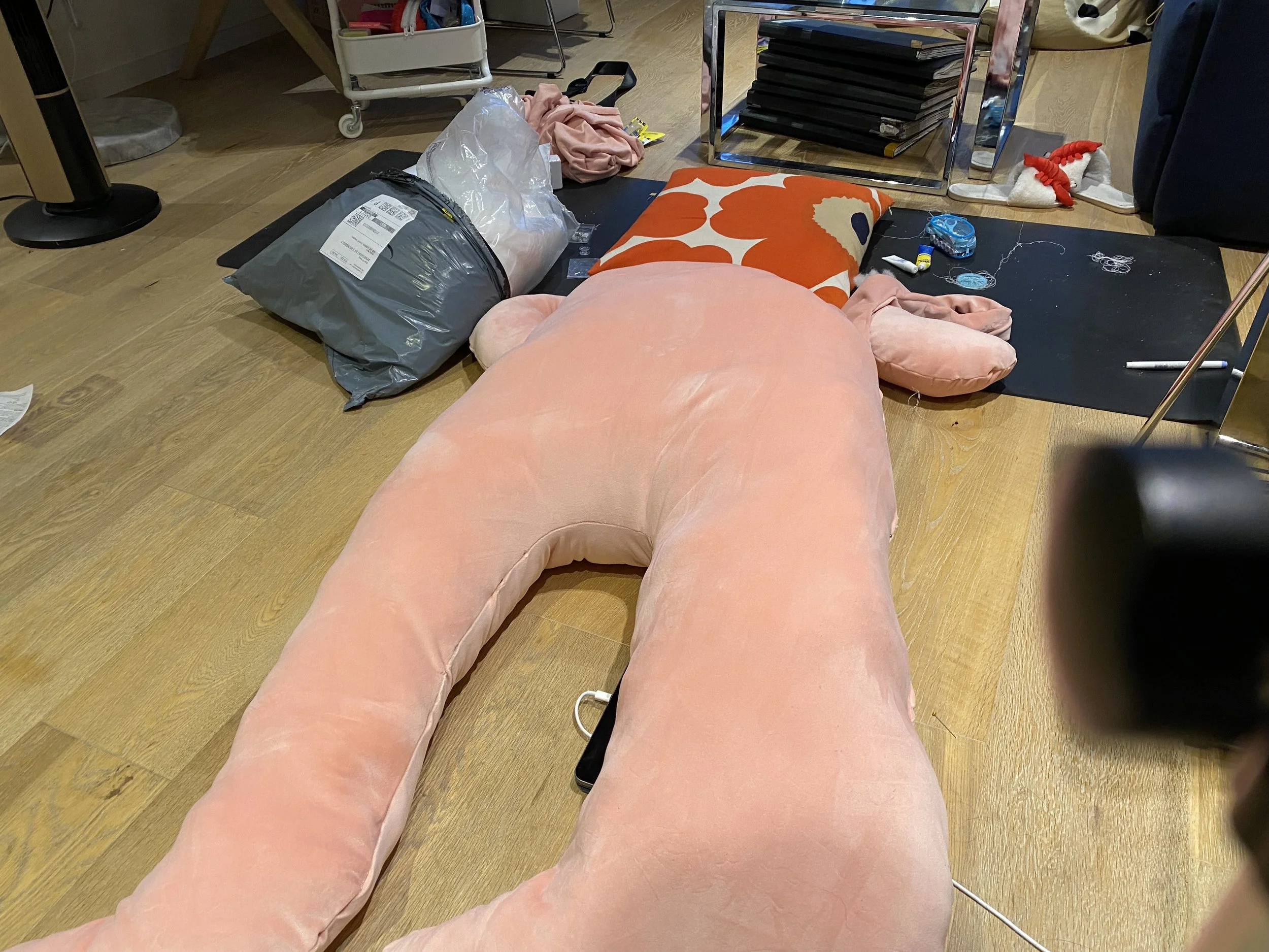
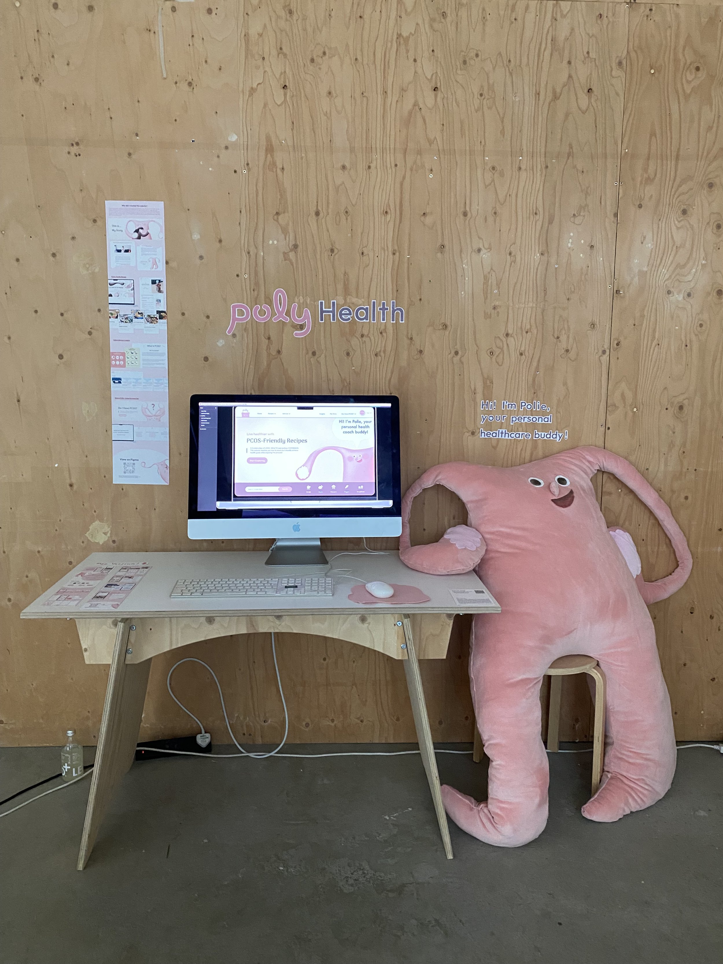
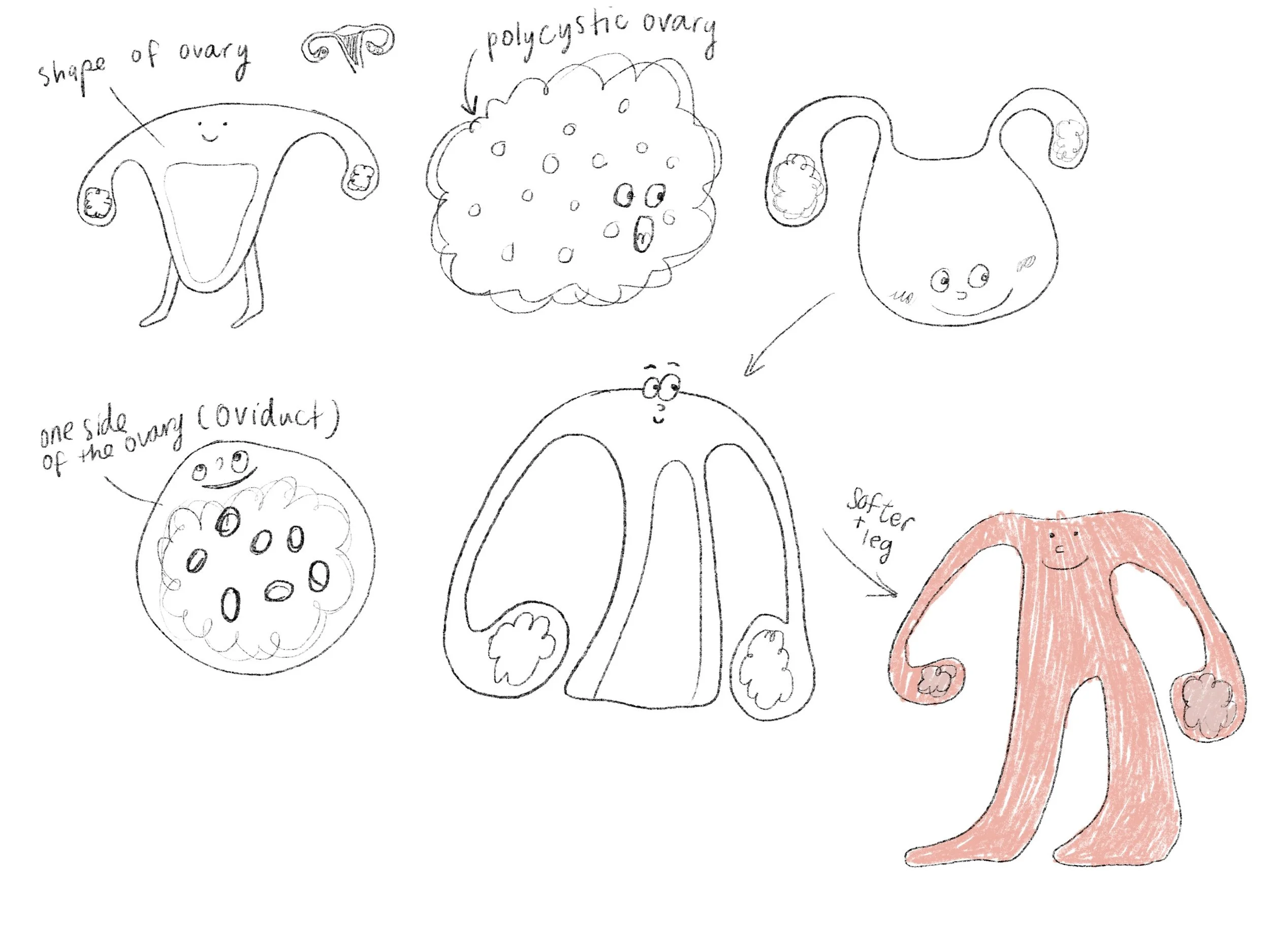
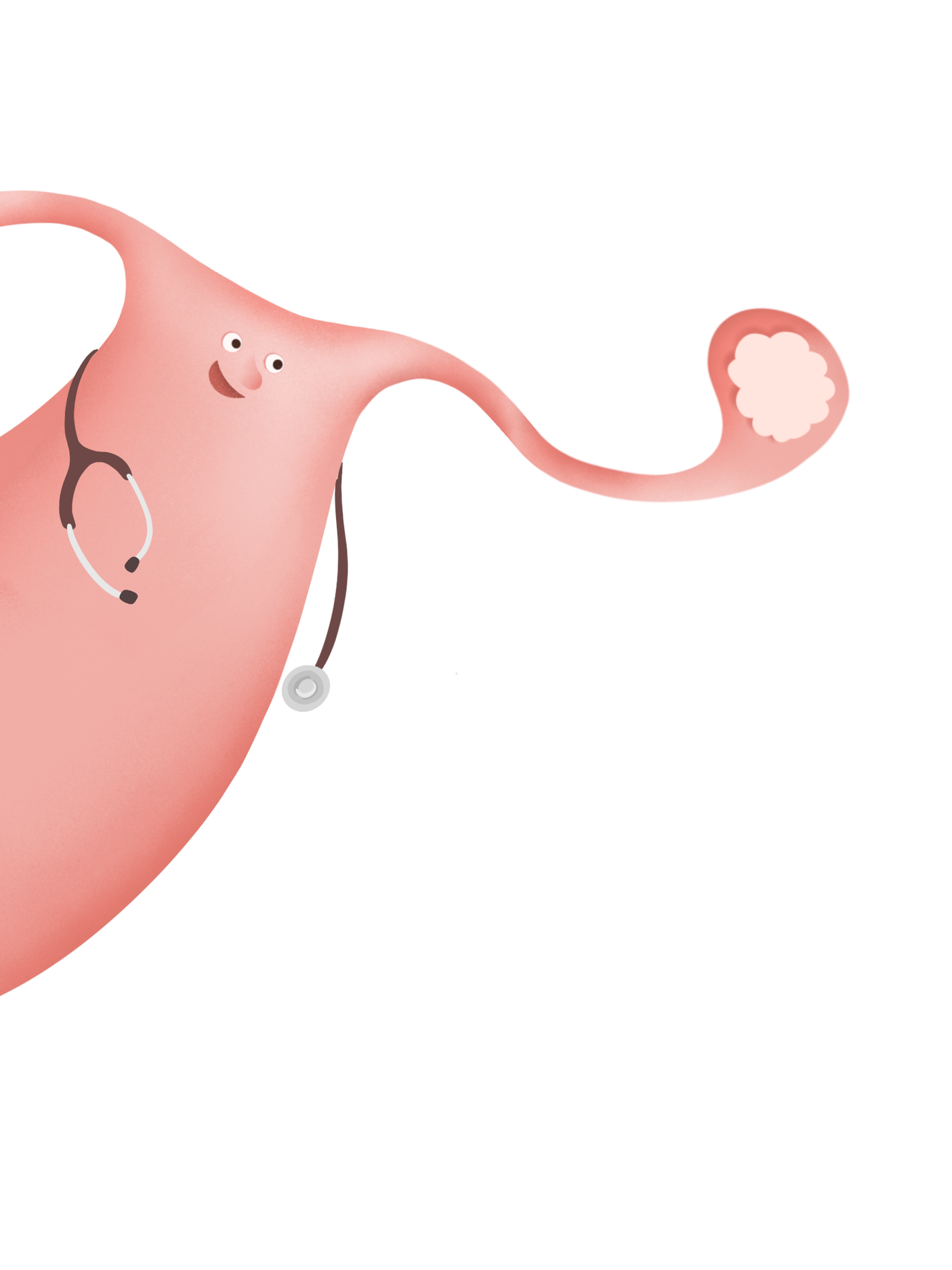
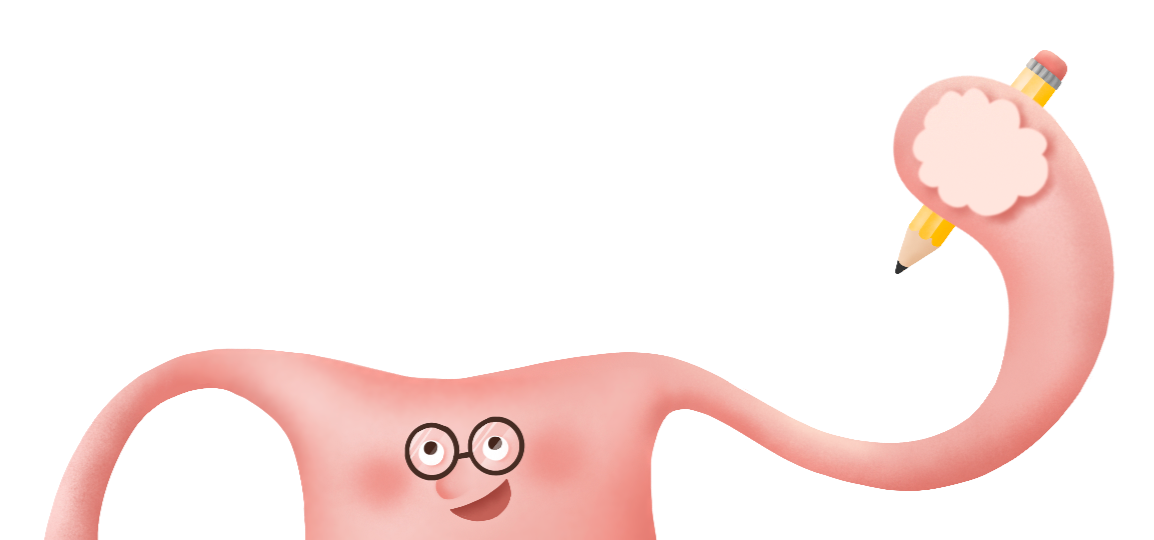
Because the website lacks face-to-face interaction, I designed a mascot named Ovie to build a warmer and more personal connection with users. The character’s design is inspired by the shape of an ovary, which is typically most affected by PCOS.
The overall color palette of the website features subtle shades of pink that evoke a sense of warmth and connection to the body, complemented by gentle browns that introduce balance and calmness. The combination creates a soft, reassuring aesthetic that feels both trusted and comforting.

User Testing
After developing the first website mockup, I performed user testing to ensure the interface was clear and easy to navigate, refining the design in response to user feedback.
Task 1:
Save the “bagel brunch platter” recipe and view it under your saved recipes
Q1: What is your age?
Q4: Was there anything that prevents you from completing this task?
If yes, what?

Q1: What is your age?
Q4: Was there anything that prevents you from completing this task?
If yes, what?
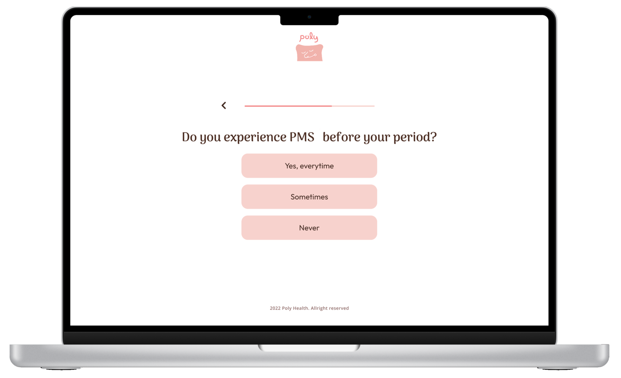
not sure what is PMS in the second question of the test
Dis not know where to find the test
General Questions:
Q1: What do you think about the entire visual design of the website?
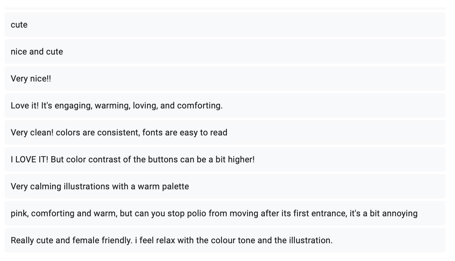
Q2: How long did you take to find saved recipe?
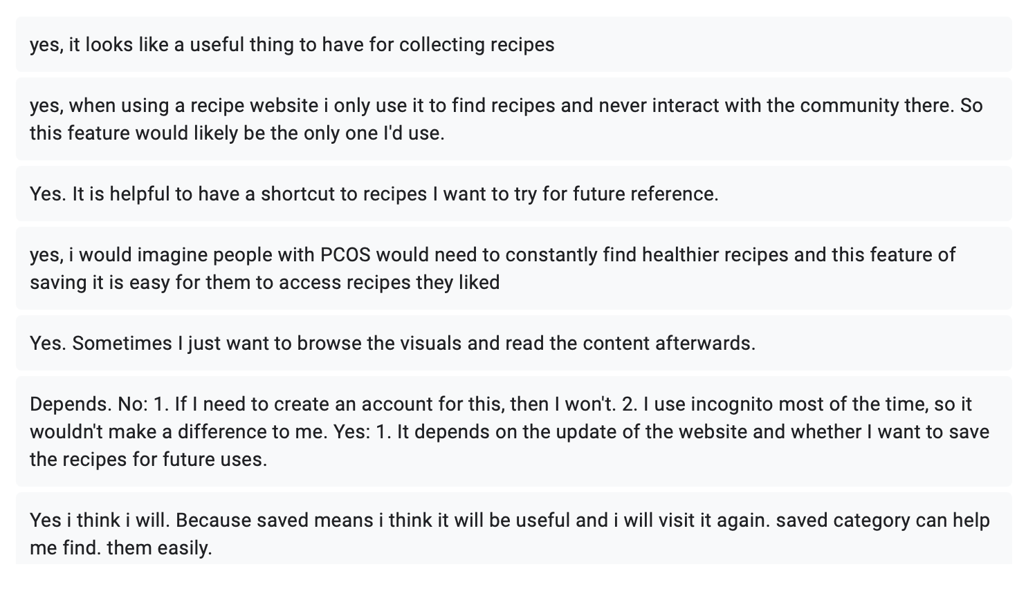
Q5: Do you think this is a feature you would use often? Why?
Why?
Task 2:
Complete the hormone test and go back to the “home” page
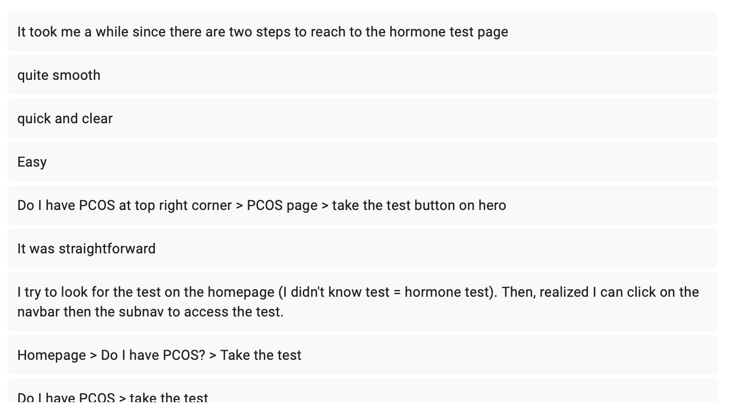
Q2: How/what was your journey of getting to the “hormone test” page
Q5: Do you think this is a feature you would use often? Why?
Why?


Q2: Is there anything (icon, button, layout…etc.) confusing
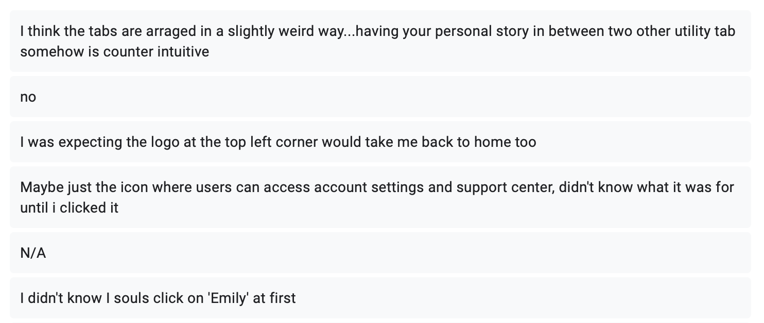
Q3: Were the buttons/icons clear and straightforward for you to complete the task?
Suggestion:
A little confused when “saved highlight” has the same icon “as saved recipes”
(See adjustment 2)
Q3: Are the test questions easy to understand?
Suggestion:
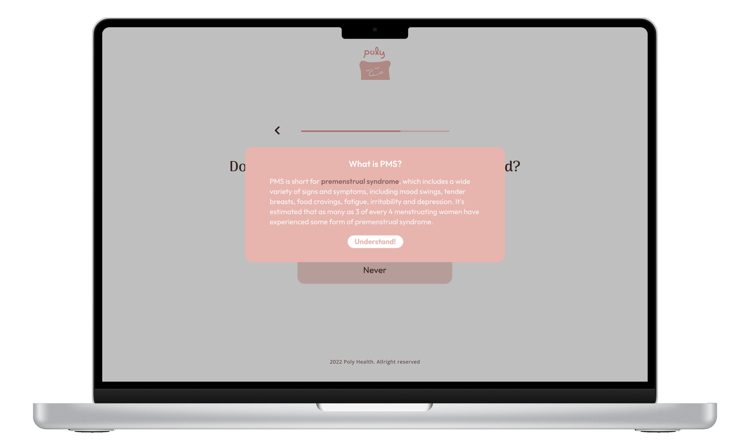
Yes, but try to use full word instead of abbreviations like PMS when it is first presented to the users! It would make more sense to users who has no background knowledge
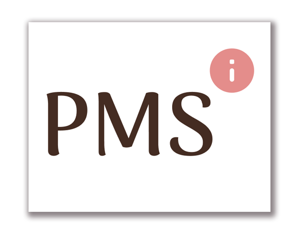
add an info icon to the question where users click to learn more about PMS might be helpful (See adjustment 3)
Q3: What did you like/ dislike about this website?
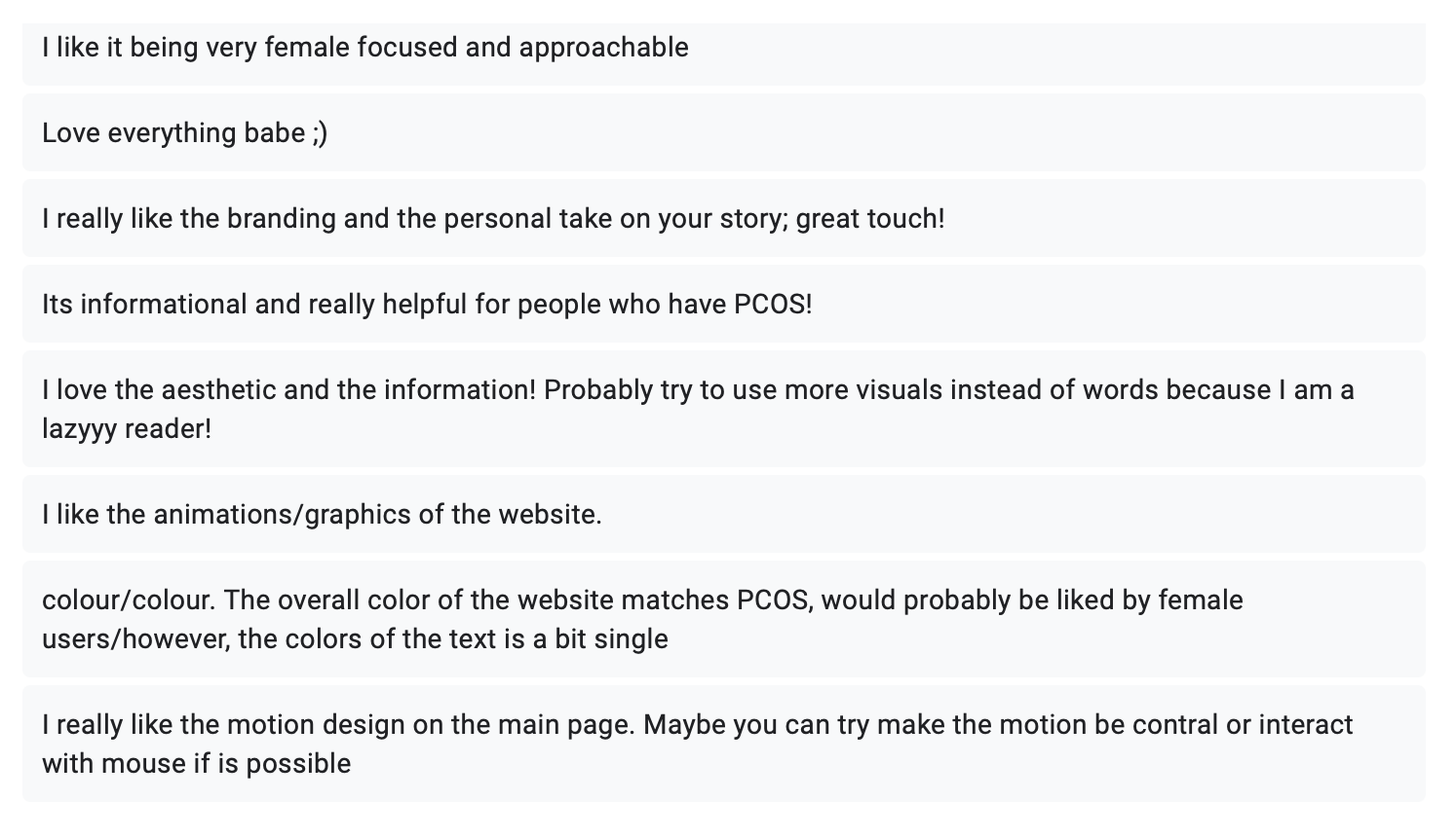
Adjustment:
1. Change the icon for “retake the test” to differentiate the two buttons
Before:
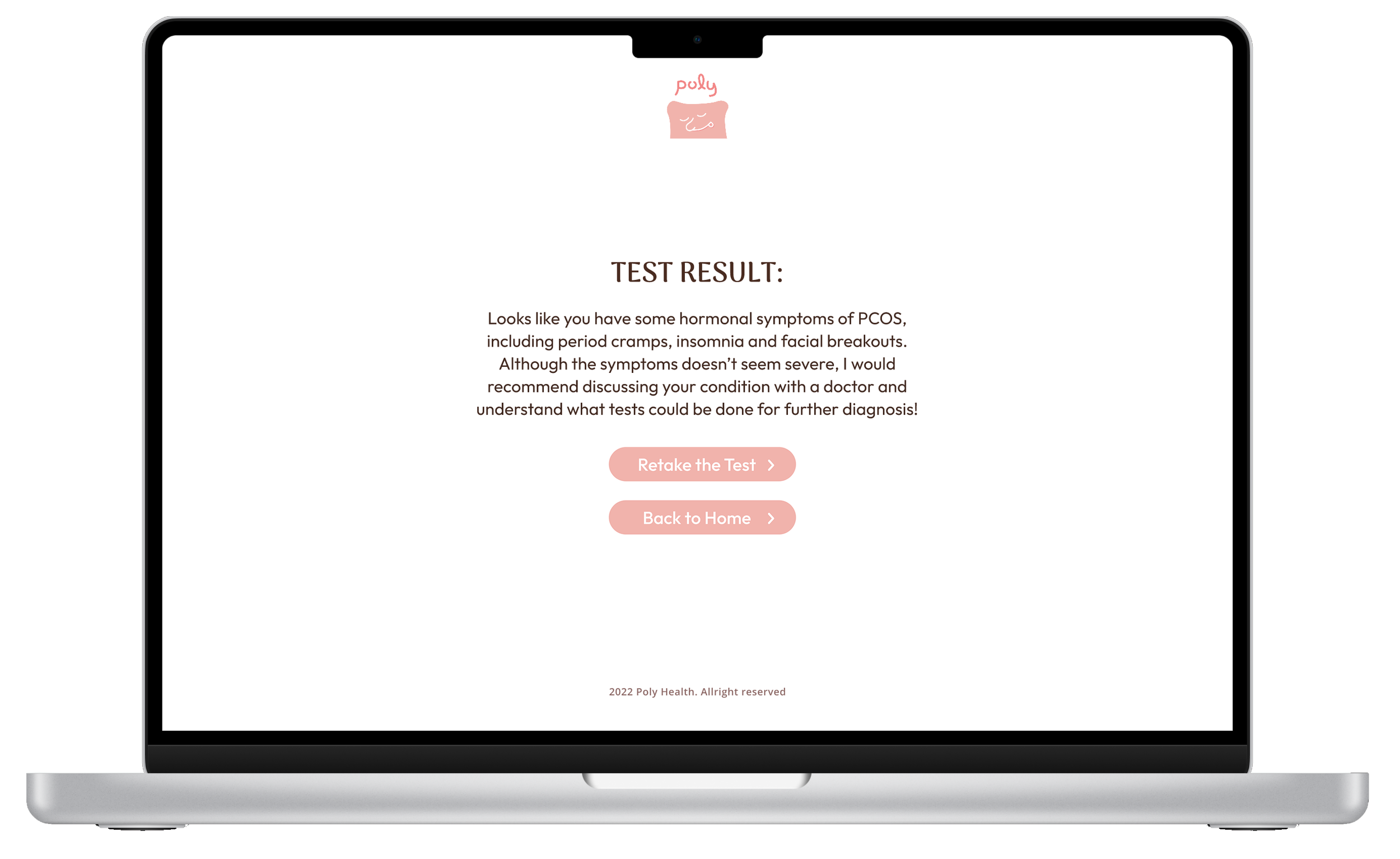
After:

2. Change icon for "save recipe" to differentiate it from "saved insights"
Before:

saved recipe
After:

saved insight
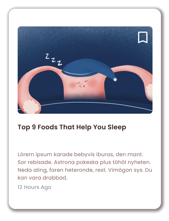

3. Add info icon next to the abbreviation so users can click to learn more about PMS
Before:
After:


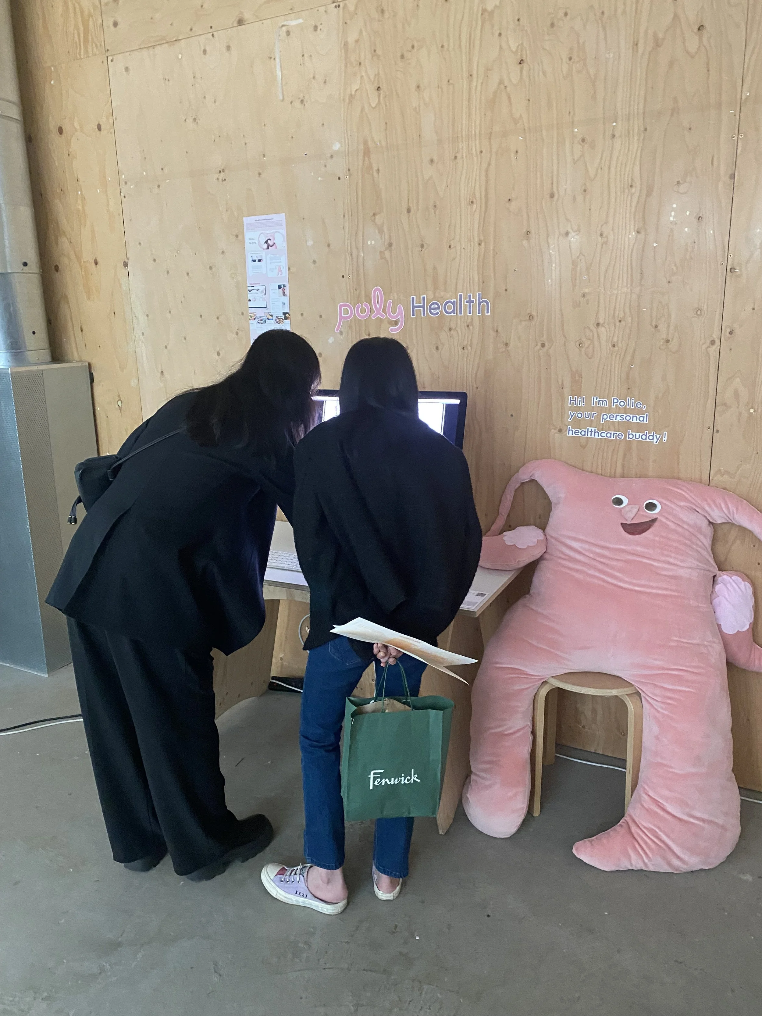
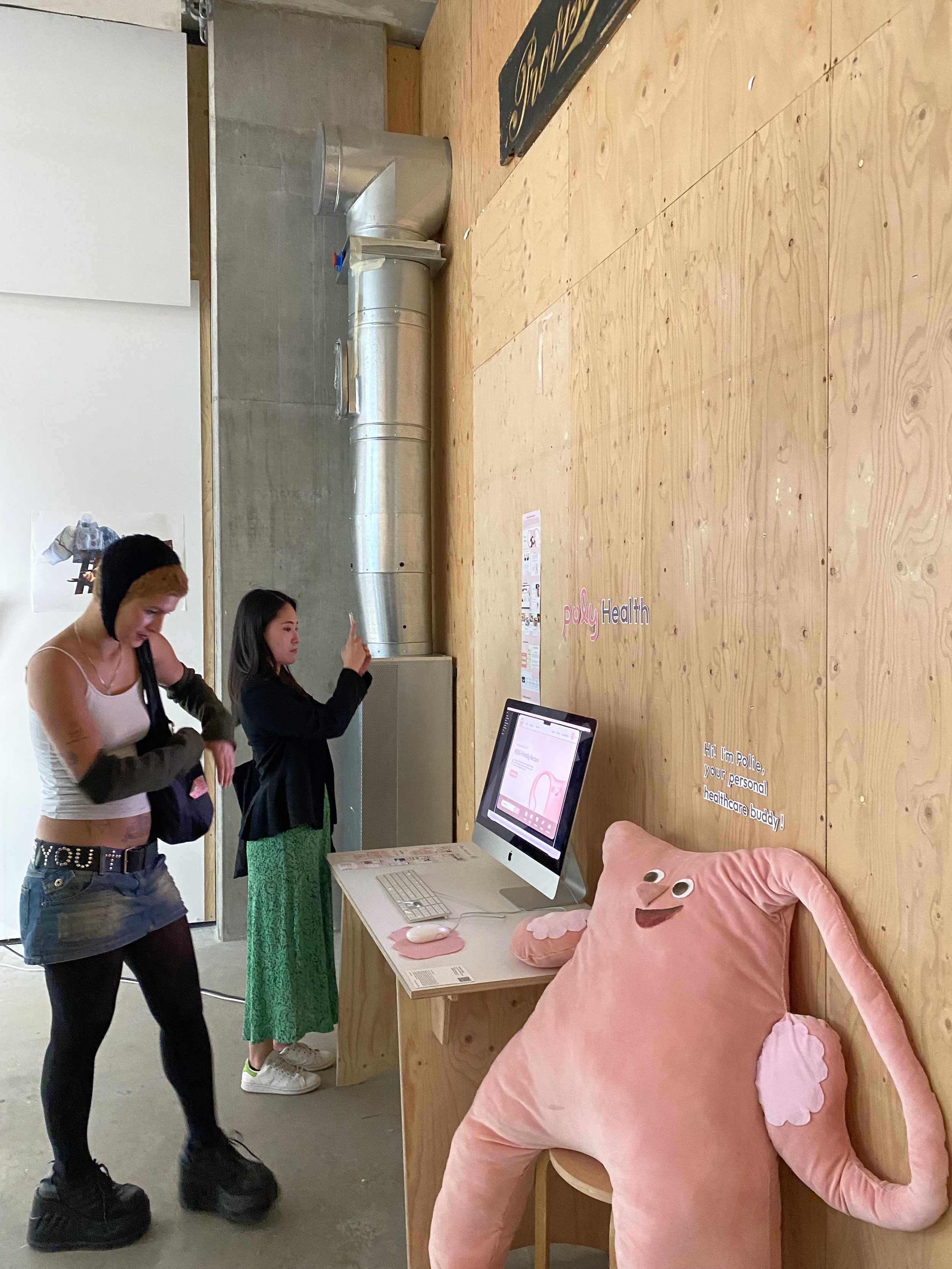
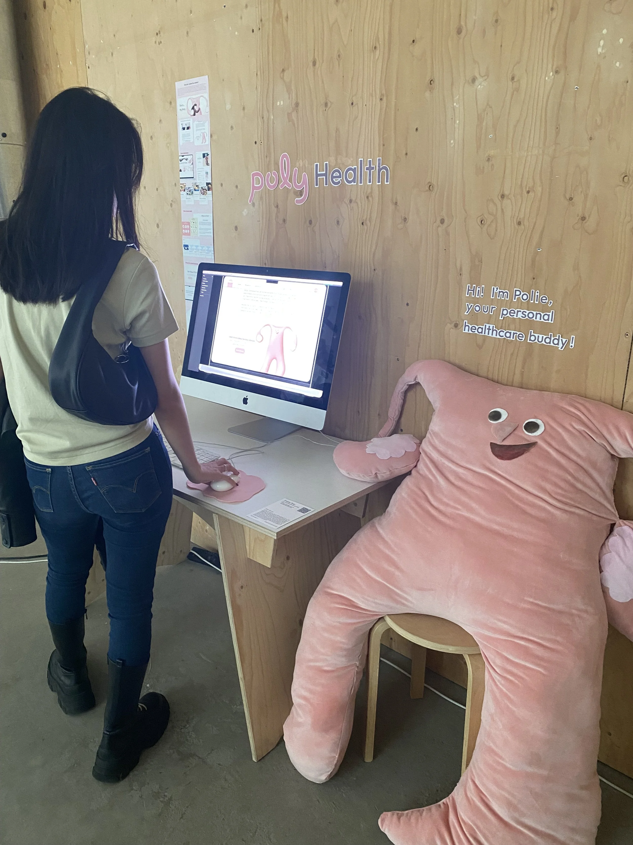
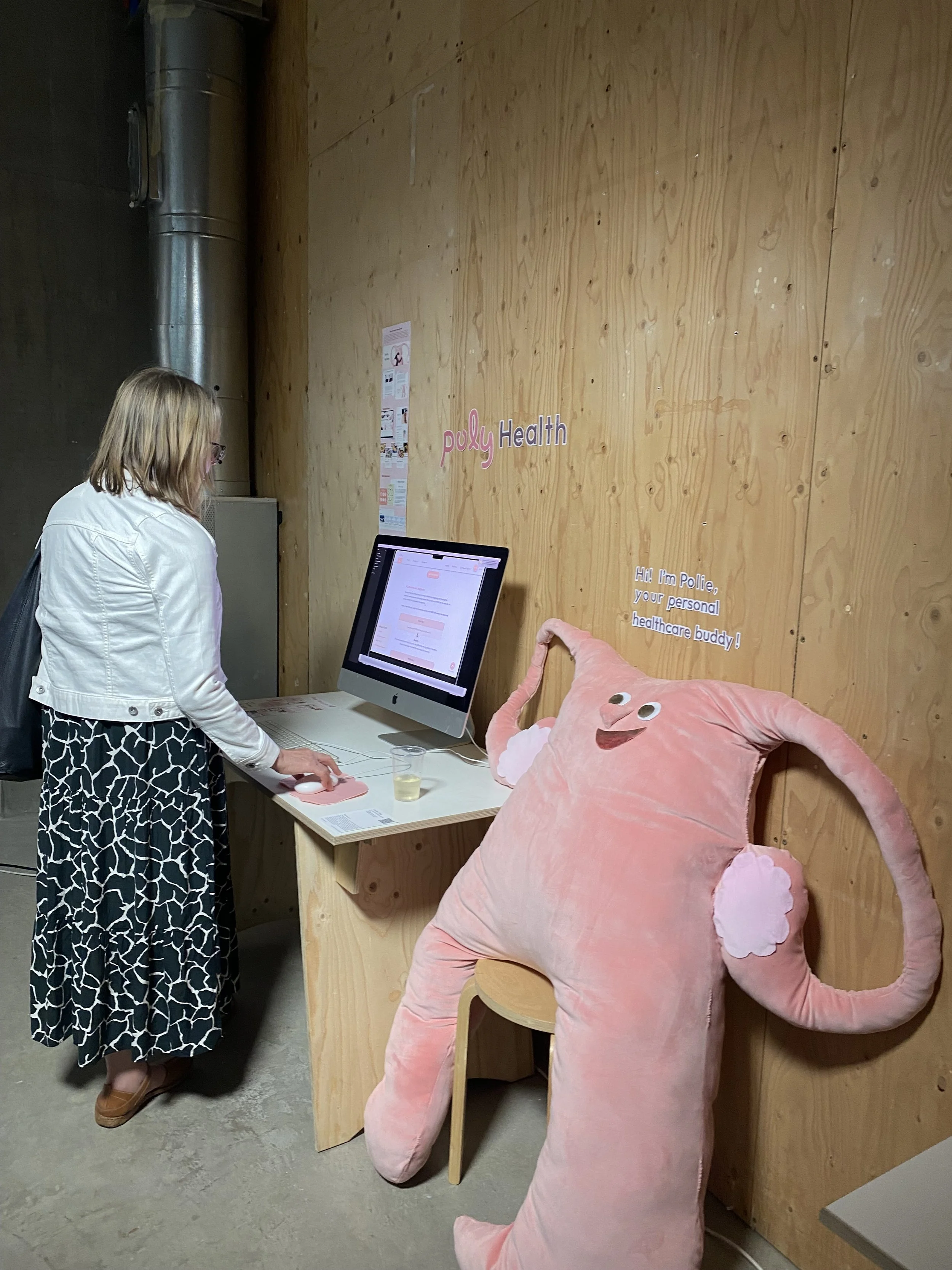
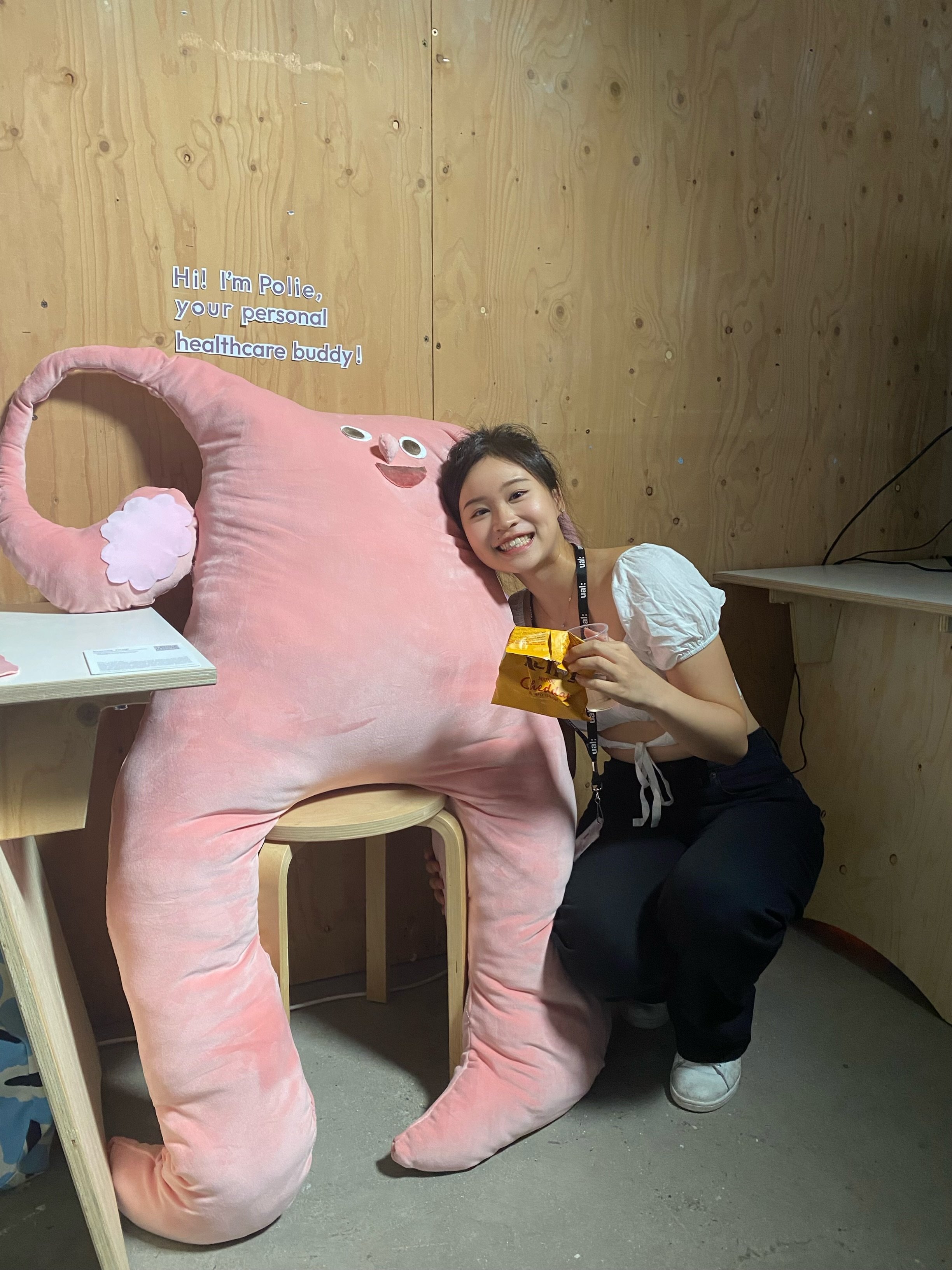
Graduate Show
Special thanks to Vivian Huang, Brandon Yu, Wendy Li, Tiffany Wong, Venessa Cheng, and my incredible family for their continuous support, encouragement, and technical + emotional advice throughout this journey ❤️
